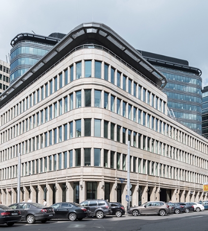
O1 Properties has made changes to its corporate identity. The changes are a logical consequence of developments in the positioning and values of the Company, formulated by analysis of the Company’s work principles and projects now being implemented by O1 Properties in the spheres of sustainable development, environmental performance of real estate, support for cultural heritage, as well as the Company’s efforts to improve the quality of city infrastructure and publicly accessible urban spaces.
Based on this analysis, an understanding of the value that the company brings to its customers has been formulated:
- We create conditions for productive work and advancement of the business of our tenants.
- We make our buildings more environmentally efficient to create safe and healthy conditions for work and doing business.
- We develop the urban environment and infrastructure, and create new points of attraction that are open to local communities.
The visual style of the Company’s self-presentation been updated to be more people-centered, though without dramatic changes. The Company logo has been slightly transformed, making it simpler and more unitary: it is now monochromatic and uses a fresher shade of blue– the colour of the sky, the future and clear vision.
Black and white images of Company properties have been replaced by bright color photographs and now include portraits of the people who work in them and enjoy spending time in them. A brand element has been introduced in the form of a gradient plate, which unites different items and successfully broadcasts brand messages in any communication format.
Elena Belevtseva, Marketing and Communications Director of O1 Properties, said: “Like our European and American colleagues, we understand that commercial real estate companies need to be closer to their end customers: not even to the abstract concept of“tenant”, but to real people, who come to our buildings every day. We have tried to move away from the classic, strict and detached language of communication, and to make the brand more human. Our new slogan “Business-driven. People-oriented” reflects this vision– we create spaces for doing business, but we think about the comfort of the end-user and provide the best conditions not just for work, but also for leisure and recreation. In particular, we are deeply committed to sustainable development and are implementing projects to enhance the environmental performance of our real estate. However, our key criterion is how these projects help to create a healthy and productive atmosphere for the people who use our buildings.”
O1 Properties has created a new website, www.o1properties.ru, to support its updated positioning and corporate identity.
Our partners in updating of the corporate identity of O1 Properties were:
in-house(work on the brand platform);
Utter Design(corporate identity and style); and
Assembly Studious(website).